I don’t even know what it’s called, but I really hope it goes the way of Comic Sans
Edit: does anyone actually know what this awful font is called?

Welcome to Lemmy Shitpost. Here you can shitpost to your hearts content.
Anything and everything goes. Memes, Jokes, Vents and Banter. Though we still have to comply with lemmy.world instance rules. So behave!
1. Be Respectful
Refrain from using harmful language pertaining to a protected characteristic: e.g. race, gender, sexuality, disability or religion.
Refrain from being argumentative when responding or commenting to posts/replies. Personal attacks are not welcome here.
...
2. No Illegal Content
Content that violates the law. Any post/comment found to be in breach of common law will be removed and given to the authorities if required.
That means:
-No promoting violence/threats against any individuals
-No CSA content or Revenge Porn
-No sharing private/personal information (Doxxing)
...
3. No Spam
Posting the same post, no matter the intent is against the rules.
-If you have posted content, please refrain from re-posting said content within this community.
-Do not spam posts with intent to harass, annoy, bully, advertise, scam or harm this community.
-No posting Scams/Advertisements/Phishing Links/IP Grabbers
-No Bots, Bots will be banned from the community.
...
4. No Porn/Explicit
Content
-Do not post explicit content. Lemmy.World is not the instance for NSFW content.
-Do not post Gore or Shock Content.
...
5. No Enciting Harassment,
Brigading, Doxxing or Witch Hunts
-Do not Brigade other Communities
-No calls to action against other communities/users within Lemmy or outside of Lemmy.
-No Witch Hunts against users/communities.
-No content that harasses members within or outside of the community.
...
6. NSFW should be behind NSFW tags.
-Content that is NSFW should be behind NSFW tags.
-Content that might be distressing should be kept behind NSFW tags.
...
If you see content that is a breach of the rules, please flag and report the comment and a moderator will take action where they can.
Also check out:
Partnered Communities:
1.Memes
10.LinuxMemes (Linux themed memes)
Reach out to
All communities included on the sidebar are to be made in compliance with the instance rules. Striker
I don’t even know what it’s called, but I really hope it goes the way of Comic Sans
Edit: does anyone actually know what this awful font is called?
This is an insult to Comic Sans
I was JUST thinking about how I see this on a bunch of ai slop and slop adjacent stuff recently!
Yes! It feels like every second restaurant in my area has suddenly gone with this font and AI slop images for their menus. Lets call it Tragic Sans or something like that.
I see that, I go elsewhere.
Tragic Sans is pretty great. Also saw Toxic Sans somewhere and really like it.
It's weird be cause you would think that whoever makes these should have the common sense to see if it's a bit too obvious or too typical. You can use just about any font in existence in AI by just telling it to use that font, but lazy ass people choose the crypto chud font.
You’re telling me they could be generating posters with Papyrus, Joker, or Wingdings font, and don’t?
Missed opportunities
It's an absolutely insane test of my faith in humanity. It just takes like 10 more words to get AI to make a sign that's at least a little different from the slop. But they won't even do that. It's like they're spitting in their own face with the disrespect they show to their own businesses or whatever they're advertising. It's nuts.
At least comic sans is easy on the eyes. easy to read.
What I come to call the "300" typeface because it's what all AI slop posters are like now. They're more or less based on "Edo SZ" which has seen very frequent use.
I first took a note about it in Like a Dragon\Yakuza games, where it's used for title script of chapters, tasks, encounters with enemies. They got trendy for a while after starting to rerelease on many platforms including PC.

It isn't really a specific font, just something AI models made to generate images have picked up on. Things that were immediately attention grabbing and bold probably got more positive scoring and reinforcement during training, so they learned to use larger more dramatic styles (this is also why you often see sort of electric or fiery glows, sparks, dramatic lighting, etc) but that doesn't really work to help a business stand out when all of them now look like that.
I'm also not sure if everyone knows this yet, but most AI image generators nowadays are split into two parts. It used to be that you'd need a prompt like poster, graphic, promotional, large text, dramatic, brushstroke font, on sign, city background, club background, microphone, This Font is the New Comic Sans bold text, high quality, but since most people do this shit through something like ChatGPT, and might just say "make me a poster that says 'This Font is the New Comic Sans'", in the background, an LLM takes that prompt and makes a more extended prompt for the image generator.
This is where a lot of this type of thing probably takes place. For example, I prompted an AI model with Convert this prompt: "Make me a poster for my nightclub" into a Stable Diffusion prompt for a poster, and it gave me: nightclub event poster, bold neon typography, vibrant magenta and electric blue lighting, silhouetted dancers in motion, smoke and laser beams, glowing geometric shapes, dark moody background, high contrast, synthwave aesthetic, centered composition, space reserved for event title and date, ultra detailed, sharp focus, professional graphic design, 8k (emphasis added by me)
Nightclub posters do sometimes have these elements, but a lot of them actually use clean typography, little to no neon inside the typography, it just made up synthwave as a relevant aesthetic to the club it knows nothing about, and simultaneously wants a dark and moody background... with something that has high contrast, neon lights, lasers, and lighting everywhere.
Both image generators and LLMs optimize for things that are bold and for excessive additions like you saw in the prompt earlier, which leads to the super sloppy, over the top, crowded designs you see on most AI posters.
The LLM / image gen AI centipede.
Sloppy drip 2
I personally didn't think Comic Sans was bad, just overused, especially in contexts where it didn't belong. (Funeral homes should have been banned from using it by industry regulation. They never did that. Anywhere in the world. This is why we need multinational legislation.)
This font, whatever the hell it is called, besmirches the good name of hand lettered sign painting and advertising that was common in advertising before computer typography. Have you seen old hand lettered ads? Unless they were in great hurry, they never left brush edges visible to this extent. It looked sloppy.
It's especially important to understand that in the early days of computing you only had a single system font or a tiny font pack of less than 10. Microsoft used a tiny pack that had Arial as their sans-serif, Times New Roman as their serif, Courier New as their monospace, and two symbol fonts. Of the three real fonts, two were incredibly computery, leaving Times New Roman as the friendliest font available.
Microsoft then set out to make a family-friendly cartoon-themed OS and set the entire OS in TNR. One of their designers took issue with it and designed Comic Sans to be a viable OS font that felt friendly and suited comic art. He was a bit late in starting, so it shipped with TNR and immediately failed, but Comic Sans ended up shipping with some versions of 95, then became a default font in Internet Explorer and Win98. As a result, it was the only friendly font on the average computer for ages.
Best use of comic sans I can recall was the OG Higgs boson discovery presentation in 2012
Yeah, that's always the exception to the rule.
If you're going to give a presentation that will change the world as we know it for the better, well, nobody gives a shit what font you will use. Go wild.
Oh, I guess I never realized it was supposed to be brush painted letters. I figured it was just trying to be edgy
This fucking shite

What on the fucking love of God is eBay live? Do we not even pretend anymore that's content and go straight to TV selling channels?
Tiktokification. Every app has a reels clone, because that shit is addicting and works at keeping people engaged.
eBay is jealous of Whatnot and is trying to copy them
What?
not
Those faces in the bottom left corner are horrifying.
Mouths of a feather slop together

Octoberfest this year had a lot of stands, all with the same AI slop posters. I bought a burger from a stand with just a handwritten sign. Felt good.
What gets me is they're all the same style. Do they not see that their posters are the same as everyone else's??
Anyone competent enough to understand that effort is a vital component of modern marketing is already steering clear of AI slop nonsense. It's the stupids that are left believing that doing something as cheaply and easily as possible won't reflect poorly on their business.
and good lord there's a lot of stupid people out there.
They each probably thought they had this great idea of getting a crazy unique AI sign before they showed up and saw that everyone had the same idea.
but I really hope it goes the way of Comic Sans
I use comic sans monospace in my terminal. But I don't want this shit in my terminal!
Right? I'll take comic sans every day over slopfont. Comic sans was at least designed with intention, for a particular purpose.
Slop font is way worse than Comic Sans.
This ! This is the exception for the rule : never slop

I’ll be honest, I didn’t make it, but looking at it I can’t tell if it’s actually slop or not. Looks like two standard photos side by side with text overlaid and a mic png
Is it really hard to write a prompt to make it not look like this? Or are people too lazy and just use the first generic slop result that they get?
Wrong. This is MUCH worse than comic sans.
New Lobster
I don't think I have ever actually seen someone talk about Lobster. Because yes, after learning about that font, I started noticing it EVERYWHERE because it's a pretty nice font and is free for commercial use.
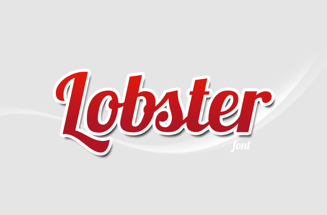
hey, the red one!