326
African Union joins calls to end use of Mercator map that shrinks continent’s size
(www.theguardian.com)
A community for discussing events around the World
Rule 1: posts have the following requirements:
Rule 2: Do not copy the entire article into your post. The key points in 1-2 paragraphs is allowed (even encouraged!), but large segments of articles posted in the body will result in the post being removed. If you have to stop and think "Is this fair use?", it probably isn't. Archive links, especially the ones created on link submission, are absolutely allowed but those that avoid paywalls are not.
Rule 3: Opinions articles, or Articles based on misinformation/propaganda may be removed. Sources that have a Low or Very Low factual reporting rating or MBFC Credibility Rating may be removed.
Rule 4: Posts or comments that are homophobic, transphobic, racist, sexist, anti-religious, or ableist will be removed. “Ironic” prejudice is just prejudiced.
Posts and comments must abide by the lemmy.world terms of service UPDATED AS OF 10/19
Rule 5: Keep it civil. It's OK to say the subject of an article is behaving like a (pejorative, pejorative). It's NOT OK to say another USER is (pejorative). Strong language is fine, just not directed at other members. Engage in good-faith and with respect! This includes accusing another user of being a bot or paid actor. Trolling is uncivil and is grounds for removal and/or a community ban.
Similarly, if you see posts along these lines, do not engage. Report them, block them, and live a happier life than they do. We see too many slapfights that boil down to "Mom! He's bugging me!" and "I'm not touching you!" Going forward, slapfights will result in removed comments and temp bans to cool off.
Rule 6: Memes, spam, other low effort posting, reposts, misinformation, advocating violence, off-topic, trolling, offensive, regarding the moderators or meta in content may be removed at any time.
Rule 7: We didn't USED to need a rule about how many posts one could make in a day, then someone posted NINETEEN articles in a single day. Not comments, FULL ARTICLES. If you're posting more than say, 10 or so, consider going outside and touching grass. We reserve the right to limit over-posting so a single user does not dominate the front page.
We ask that the users report any comment or post that violate the rules, to use critical thinking when reading, posting or commenting. Users that post off-topic spam, advocate violence, have multiple comments or posts removed, weaponize reports or violate the code of conduct will be banned.
All posts and comments will be reviewed on a case-by-case basis. This means that some content that violates the rules may be allowed, while other content that does not violate the rules may be removed. The moderators retain the right to remove any content and ban users.
News !news@lemmy.world
Politics !politics@lemmy.world
World Politics !globalpolitics@lemmy.world
For Firefox users, there is media bias / propaganda / fact check plugin.
https://addons.mozilla.org/en-US/firefox/addon/media-bias-fact-check/
Dymaxion.
Waterman is nice and all, but I don't like the way it splits Australia and New Zealand, or how it puts Antarctica in a separate bit like Alaska in USA maps.
Dymaxion offers a nice continuous view of all the continents, and can still be folded into a sufficiently spherical globe-like thingy.
It'd be nice to have an alternative version that made the oceans continuous, though, for people who like ships and stuff.
Damn the Goode called me tf out
Shoes with toes wtf

I've heard they're very comfortable but they do look weird
“It’s [the Mercator projection] the world’s longest misinformation and disinformation campaign, and it just simply has to stop.”
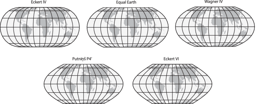
No matter how we cut it though, all 2D projections will have some kind of distortion. They opted to preserve area, while the Mercator preserves angles. Arguably it is less important today to preserve angles, as we have automatic navigation systems. There are some alternatives that also preserve the area: https://upload.wikimedia.org/wikipedia/commons/7/76/The-Equal-Earth-compared-to-similar-equal-area-pseudocylindrical-projections.png
Right. What people need to understand that any globe put on a flat surface will be distorted. Their proposal is just as distorted as the Mercator, just in area vs angles as you stated.
Its a good thing you came along to reiterate that.
Just fyi this 2D projection is also distorted just in angles instead of area.
It's not a damn campaign. Activists never seem to be good at nuance.
We should encourage the use of more globes to represent world maps.
Like, seriously. Almost all maps are viewed on a computer screen, all computers easily have the ability to display a sphere and rotate it
Kinda hard to fit a globe inside a school book, or any book
It's kinda easy to have globes in school though. Doesn't need one per student.
The simple fact is no map projection will be perfect or do anyone "justice".
You're flattening out a sphere to a flat rectangle. A lot of compromises have to be made. So go with the one that functions best for navigation.
Some projections are better than others. The Mercator projection at least has a use case that justifies its creation. This map has no purpose other than a political one.
Everyone with a cursory knowledge of maps knows there are inherent issues protecting a 3d object into a 2d surface. That's fine because some projections are useful
Well a rectangle gives you easy direction, true north is always up. But you can map very accurate maps that are not rectangle. They just make navigation a bitch
I'm going to be honest, this just looks utterly useless for any country that isn't south africa, and ESPECIALLY useless for any country in the northern hemisphere.
Like, yes, sure, you've made all the country's areas roughly equal, but also every single country that isn't south africa is a distorted, warped mess that looks nothing like its actual shape.
Look at parts of europe- every country is a COMPLETELY USELESS shape. Three quarters of them have been turned into diagonal lines. How the fuck is that useful? Europe is the worst area in that regard, but by no means the only one.
It makes it literally useless as a map.
Every country looks distorted and warped based on your lifetime of experience looking at mercator projection. Every country looks warped and distorted when compared to globes. We learn geography on a flat surface which is inherently distorted because we live on a round surface
Actually, fun fact, the entire point of the Mercator projection is that it DOES maintain shapes/angles, just not scale. It's a nautical map, it's for sailing. That's why when you look at a mercator map and a globe, the countries look about the same, just potentially different sizes- because that's literally the point of it.
Who actually uses it as a map though? It's usually only seen briefly in apps, or in various symbols, or on a classroom wall. As a symbol, having the rights sizes would be a significant improvement. In an app, people will zoom in anyway, so at least they'd passively see the correct proportions when zooming out, instead of getting a false impression. In a classroom, it would seem all that more importantly to not give false impressions to kids.
This is truly the concern of our time.
I really like the Dymaxion projection.
I prefer to unfold a map to read it, as opposed to doing origami just to figure out where I'm going.
Gerrymappering.
This is like that one American Dallas county commissioner, William Price, getting offended it's called Black Hole.
The notion that projections perpetuate some racial agenda is exactly the pseudo-intellectual victimhood that takes away oxygen in the room for actual issues to be addressed.
Me when someone calls my pp smol
Like completely, or just as a default?
It's uniquely the best option if you like using compass bearings.
Ok come up with something that's better and just as practical.
They did. They are specifically advocating for the Equal Earth projection.
I mean everything is approximately to scale i guess, but the further east or west you get from Europe/Africa the more bent things get. Including the area that 75% of the worlds population live.
Well yeah, every map projection has to mis-represent something. In this case they're arguing that presenting area is more important than presenting angles. Outside of long-distance travel on ships and planes, which are not using general-purpose world maps, nobody is navigating with a world map, so I think that they're probably right here. It seems more important to me to understand the relative size of Africa to other landmasses than it is to know that the Korean peninsula is actually a few degrees off of being straight north of Borneo
It was very much a real discussion back then as well. The writers didn’t invent this argument.
People have been complaining about maps in general since we first started making them. The Gall-Peters projection that they mentioned traces its origins back to 1855 when James Gall first introduced the concept.
In the 1970’s, Arno Peters made this projection well known. He specifically argued the point the show makes: other maps distort our perception of the world and it fosters problems with how we treat some countries.
https://en.m.wikipedia.org/wiki/Gall%E2%80%93Peters_projection
I was honestly not aware. Learn something new every day!
You’re welcome, enjoy your odd new fact :D
Stuff like this is why I really enjoy The West Wing. It often has interesting real world arguments that it plays out smartly. A bit too optimistic in our current political climate, but still fun to watch.
Such a beautiful scene.
"But you can't do that!"
"Why not?"
"Because you're freaking me out!"
I think equal area maps make a lot of sense, but the one I’ve seen promoted in the past as “fair” is the Peters Projection which is quite frankly trash.
It was designed to preserve angles at the equator, and as a consequence all the shapes at higher latitudes are badly squished in the vertical.
If there has to be distortion to preserve areas, it should squish in both dimensions and try to optimize shapes around the middle latitudes.
